

Do Dedicated Lanes Promote Development?
Do Dedicated Lanes Promote Development?
Not If IndyGo's Red Line Is Any Indication
So-called bus rapid transit (“BRT”) routes tend to be distinguished by street lanes that are dedicated to their buses, and dedicated-lane proponents often contend that BRT routes attract development that conventional bus routes would not. The arguments in favor of that contention vary, but some seem to believe that being located on a BRT route will bring a business more customers than being located on a conventional route would. In this post we will see that traffic data from the route of Indianapolis’s Red Line, the only BRT route the Indianapolis Public Transportation Corporation (“IndyGo”) operates so far, suggest that the opposite may actually be true.
This post was prompted by a recent series of tweets from an Indianapolis-area outfit that calls itself Transit Drives Indy (“TDI”). TDI says it’s “a coalition comprised of organizations across Marion County” that “seeks to educate citizens and visitors in Marion County on the benefits of public transportation and to monitor the implementation of the Marion County Transit Plan.” TDI was quite active some years ago in spreading propaganda in favor of an income tax dedicated to subsidizing IndyGo.

The story it told residents before a 2016 referendum on the subject was that approving the tax would by 2021 get the city three bus-rapid-transit (“BRT”) routes and a 70% increase in service hours. Flooded with those and similar representations, voters approved the tax. But even though 2021 ended two years ago very little of what TCI promised voters has yet come to pass. The service-hours increase has been only 14%, only a single BRT route is operating, and despite that route’s dedicated lanes its buses have averaged only about a tenth of a mile per hour faster than those of routes having no dedicated lanes. As we noted in a previous post, in fact, they’re actually slower in some months.
So the Indiana General Assembly is now considering a moratorium on further dedicated lanes. The moratorium wouldn’t affect the use of dedicated lanes on BRT routes already in operation or under construction, but it would prohibit dedicated lanes on IndyGo’s proposed Blue Line, which is only in the planning stage. And TDI tweeted the above-mentioned thread in opposition.
“BRT requires dedicated lanes,” it tweeted, even though the Red Line is often slower with dedicated lanes than other routes are without them. More to the point here was its implication that a BRT route would spur enough development to justify the subsidy such a route would require. “Studies, are in fact, important,” it said in that connection, “and they have been conducted, not only for Indianapolis but across the nation as well.” But what the three “studies” it thereupon cited actually demonstrate is how little substance there is in the argument that BRT routes are a driver of development.
One of those “studies” was just a puff piece prepared by the lead consultant on a Richmond, Virginia, BRT project. Merely listing destinations on the BRT route, it made no attempt to show that the BRT service increased Richmond development.
Another one did indeed focus on development near BRT routes. But it provided little if any evidence of causation. Indeed, it explicitly stated the following about a different study’s sweeping claim that “Of the 21 corridors we studied, 14 leveraged greater than $1 of [transit-oriented-development] investment per $1 of transit (funds) spent”:
We . . . caution that these are not cause-and-effect outcomes. Some, most or even all investment near transit stations may have occurred anyway, or may have merely located near stations rather than elsewhere in the metropolitan area, resulting in no net development gain.
Such caution is merited. The proposition that tax money “invested” in new bus routes will be more than paid back in tax revenues from the resulting development is beguiling, not least because early in the previous century streetcar lines—which, incidentally, were mostly unsubsidized—almost certainly did attract development. Despite boosters’ claims, however, there’s very little evidence that such last-century technology can still attract much development. More typically, “transit-oriented development” requires still more subsidy. Consider, for example, this observation by transit expert Randal O’Toole about his Oregon home town:
Because the demand for living in small apartments on noisy streets is limited, Portland and other cities have had to subsidize such developments. When Portland opened its first light-rail line in 1986, it zoned everything near light‐rail stations for high-density development. Ten years later, planners reported to the Portland city council that not a single such development had been built. To encourage such development, the city decided to use a variety of subsidies, the most important of which was tax-increment financing, to dense developments along the transit lines. Overall, Portland has spent roughly $5 billion building its light-rail system and close to $2 billion subsidizing developments near rail stations.
Moreover, even in the unlikely event that every million dollars taxpayers pour into a BRT route did cause more than a million dollars in development, there’s no proof that such development would provide taxpayers more than a million dollars of benefit. The increased traffic congestion and demands on city services caused by, say, an apartment building or condominium development could sharply reduce or completely cancel out any benefit taxpayers get from a tax-base increase—particularly if that development gets subsidies like the tax-increment financing the Indianapolis City-County Council hands out like candy.
Perhaps the most interesting of the three studies TDI cited was commissioned by the national subsidized-transit lobbying group, the American Public Transportation Association (“APTA”). Here’s what TCI tweeted about it:
This groundbreaking study shows that planned public transportation investments will yield a 2 to 1 return while helping generate income for local businesses, its workers & their neighborhoods. This investment will yield >$174 billion in business sales in the 3 cites examined.
A perusal of that study suggests that TDI’s claim was based on the study’s following passage:
In the three innovation districts studied, local economic development officials and planners expect public transit, by 2045, to become the determining factor in:
• over $177.83 billion of cumulative business sales through 2040;
• $78.8 billion in wage income; and
• $106.3 billion in gross domestic product (GDP) in the U.S. economy.
But the study gave no quantitative reasoning behind those numbers, which seem to have resulted merely from interviewing, as the authors put it, “representatives from local metropolitan planning organizations (MPOs), economic development organizations, planning agencies, and area businesses.” Remember, those are the types who routinely make predictions that bear little relationship to reality.
The Indianapolis MPO, for example, was instrumental in encouraging the belief that a transit tax would produce three BRTs by 2021. Planner types use models such as the one that “conservatively” projected 11,000 riders per day on IndyGo’s Red Line, whereas after four years of operation that BRT route still doesn’t average even 30% of the predicted volume. Or the model mentioned in a prior post, which gave seventeen minutes as the travel time without dedicated lanes on a stretch of the Red Line route that in real life buses without dedicated lanes were routinely traversing in only seven.
In this respect the APTA study was just drearily typical of how poorly reasoned the studies are that subsidized-transit proponents tend to perpetrate. But what made it interesting, despite the shallowness it otherwise exhibited, was a passage in its pages 6 and 7 that nicely encapsulated the density compromises to which urban planners so often seem oblivious.
After describing factors that can make it advantageous for knowledge enterprises to locate near each other, the APTA study observed that such “centripetal” forces are counteracted by “competing ‘centrifugal’ (outward) forces, which also tend to arise with density and act to push economic activities toward the periphery of an area.” “Each firm, therefore, faces a tradeoff between centripetal (needing to co-locate with other firms) and centrifugal (need to avoid crowding) forces.”
Absent distortions such as subsidies, the study might have said, price signals will guide some businesses to locate closer together and some farther apart in such a manner as approximately to optimize aggregate resource allocation. Unfortunately—but predictably for a study commissioned by a transit-subsidy proponent—the APTA study failed to follow that observation to the logical conclusion that transit shouldn’t be subsidized.
Rather than point out all the logical shortcomings that beset transit-subsidy proponents’ claims, however, our purpose here is to consider an aspect of Red Line performance that should add to the skepticism those shortcomings justify. Specifically, we will show that the Red Line’s dedicated lanes seem to have reduced the number of people in vehicles to which businesses on the Red Line route are exposed.
We draw this conclusion in part from traffic data that the Indiana Department of Transportation (“INDOT”) has provided for locations along the Red Line Route. INDOT apparently uses some combination of measurement and modeling to calculate annual-average daily traffic volumes for various locations across the state. Data for four locations on the Red Line route suggest that the advent of the Red Line in September of 2019 reduced their vehicle volume.
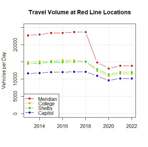
The plot above depicts the INDOT data from those four Red Line locations: College Avenue just north of 38th Street, Meridian Street just south of 38th, Capitol Avenue between 10th and 11th Streets, and Shelby Street just south of Raymond Street. At all four locations the reported average traffic volume significantly decreased in 2019 and 2020, recovering only a little by 2022. As a result, the traffic volume in 2022 was between 16% and 41% less than in 2018, the weighted average suggesting a 28% reduction in the volume of vehicle traffic to which the average business on the Red Line route is exposed. In absolute terms the vehicle traffic averaged over those locations fell from around 16,500 vehicles per day in 2018 to about 11,900 in 2022.
Even if the number of vehicles falls, of course, an increase in the proportion that are buses could in theory result in an increase in the number of vehicle occupants to which businesses are exposed. But in actuality the increase in bus traffic did little to make up for the overall reduction in vehicle traffic.
Specifically, data from the Federal Transit Administration indicate that in 2022 IndyGo’s BRT buses traveled 715,899 vehicle miles on 26.1 directional route miles. That implies that the Red Line’s buses pass a given location on its route an average of 150 times per day (≈ 715,899 miles/year ÷ 365 days/year ÷ 26.1 miles/round trip × 2 times/round trip). Those 715,899 vehicle miles provided 3,540,990 passenger miles, moreover, implying an average 2022 occupancy of 4.9 passengers per bus (≈ 3,540,990 passenger-miles ÷ 715,899 vehicle-miles). But because the Red Line’s ridership was 12.1% greater in 2023 than in 2022 we’ll call the occupancy about 5.5 passengers per bus, implying that about 830 Red Line passengers per day pass an average location.
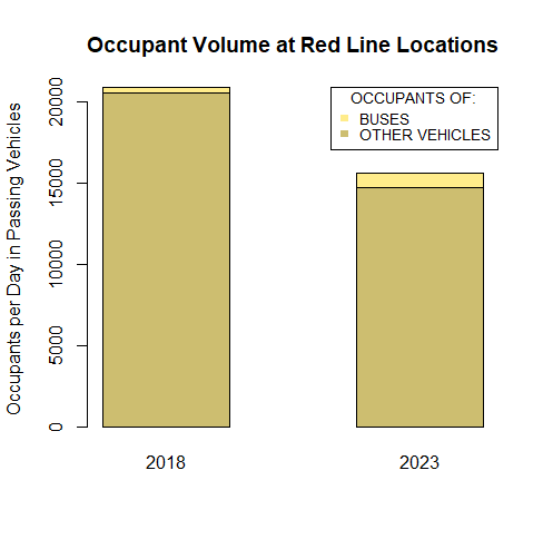
As the plot above1 illustrates, this number of bus passengers is dwarfed by the loss in other vehicle occupants. In that plot we’ve assumed that the average occupancy of other vehicles is about 1.25 and that before the Red Line the route it now takes saw about 38% as many bus riders as it does now. These assumptions are only rough estimates, but the resultant uncertainty doesn’t affect the overall conclusion; the decrease in other vehicles’ occupants would still have dwarfed the number of bus passengers even if we had assumed that the route saw no buses before the Red Line and that every non-bus vehicle carried only a single occupant.
This calls into question the proposition that dedicating lanes to the Blue Line’s buses will cause businesses located on its route to enjoy more customers than they otherwise would.
Claims made for increased development are of a piece with most other claims trotted out in favor of Blue Line dedicated lanes: they lack proof. For example, the press and (sometimes intemperate) politicians seem to take for granted that dedicated lanes contribute to safety. But it’s far from clear that dedicated lanes would have prevented the tragedy they exploit in support of that proposition. And dedicated-lane proponents seem to ignore the adverse effects of making the street’s configuration more confusing, causing more U-turns, having bus riders walk to the middle of the street to board a bus, and shifting traffic from the artery to the neighborhoods.
True, dispensing with dedicated lanes could put in jeopardy some of a reported $150 million in potential federal support. But it’s highly unlikely that the $150 million in expenditures funded by that federal money would provide $150 million in benefits to residents; as we’ve just seen, the money expended on the Red Line reduced rather than increased the Red Line route’s capacity for human transportation.
Similarly, there are plenty of studies that claim BRT attracts development. But they tend to be as lacking in substance as the ones TDI cited. And despite having been given a month by the Indianapolis City-County Council’s Municipal Corporations Committee to prepare her answer IndyGo’s CEO was unable to provide any hard evidence that most of the development IndyGo attributes to the Red Line wouldn’t have occurred somewhere in Indianapolis anyway.
When we actually subject the questions to quantitative analysis, on the other hand, we have every reason to believe that the Blue Line’s dedicated lanes will cost residents more time than it saves them. We similarly find little reason to believe that the Blue Line will provide significantly better service to the Indianapolis International Airport than Route 8 already provides without dedicated lanes—or at least could provide if IndyGo chose to have Route 8’s buses come as often on the West Side as they do on the East Side. And, as we just saw, providing dedicated lanes to the Blue Line is unlikely to attract more customers to businesses along its route.
The more we examine the case for dedicated lanes, the more it evaporates.
ADDED on February 11, 2024:
In response to a reader comment, the following bar plot is presented as an alternative to the bar plot above:
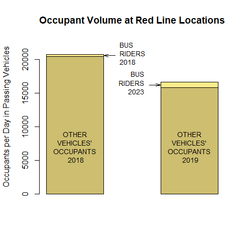
Obviously, this plot differs little in essence from the original. Like the original, it indicates that the number of people in passing vehicles seen by businesses on the Red Line route decreased when the Red Line began operation in 2019. And, indeed, the two plots are similar in most specifics.
The overall traffic volumes on which both bar plots are based, for example, are INDOT estimates of annual-average daily traffic averaged over four locations on the Red Line route. Of the overall traffic volume for the right-hand bar the portion attributed to buses and therefore subtracted from the overall volume to obtain the other-vehicle volume is the value inferred as described above from FTA data for the Red Line’s 2022 vehicle revenue miles and directional route miles. For the left bar, which represents the volume before the Red Line, the portion attributed to buses is half the right-bar value in order to reflect the lower frequency of the Red Line’s predecessors.
The bus occupancy assumed for the right bar in order to calculate the depicted passenger volume is the value inferred from the FTA data for 2022 but scaled up by the ridership increase in 2023. Based on a comparison of the Red Line’s 2023 ridership with the 2018 ridership of Routes 17 and 22, which the Red Line replaced, the left bar’s passenger-volume value is 38% of the right bar’s.
Except for a minor refinement of the left bar’s other-vehicle volume, the foregoing two paragraphs apply to both bar plots. The plots differ only in that the INDOT estimates on which the new plot’s right-hand bar is based are those for 2019 instead of 2022. It still uses post-pandemic values for the bus-rider volume, though, because ridership in 2019 was atypical; in that year the Red Line was a novelty, and fares were free for three of that inaugural year’s four months of operation. (Because of poor fare enforcement the Red Line is effectively almost free now, too, but after four years of operation the Red Line is no longer a novelty.)
The alternate plot was prompted by a comment to the effect that because of the pandemic-caused trend toward working from home the traffic on the Red Line route might have decreased even without the Red Line’s dedicated lanes. This suggests that by basing the right-hand bar on post-pandemic data the original bar plot may have overestimated the reduction that dedicated lanes caused in the volume of passing vehicle occupants. The new bar plot avoids that problem by basing its right-hand bar’s overall vehicle volume on the year before the pandemic hit.
Now, upon further reflection the use of 2022 traffic volumes actually seems more likely to understate dedicated lanes’ effect than to overstate it; INDOT data for Marion County as a whole indicate that its city streets conducted 15% more traffic in 2022 than in 2019, not less. Because of uncertainties in data for specific-location volumes, though, the new bar plot is probably still preferable to the original one.
Specifically, the INDOT annual-average-daily-traffic (“AADT”) data are based on measurements that at most locations are taken only about once every three years, and then for only a single 24-hour period. The measurement for a given location is just seasonally adjusted to produce that location’s AADT value for that same year, but for years between measurements the AADT values are based on statewide growth factors applied to a previous year’s measurement. It just so happens that the measurements on which the 2019 INDOT estimates we used for the right-hand bar were based were actually taken in 2019, so they should be more accurate than the 2022 estimates, which were based on growth factors. Even though the alternate bar plot’s left-hand bar is based on growth factors just as the original one’s is, therefore, the alternative may be preferable.
And what the location-specific traffic data it uses say for those four Red Line locations is that their average fell by 22% when the Red Line began operation, whereas county-wide figures indicate that volume on city streets generally rose by 3%. So it’s entirely possible that this alternative plot actually understates the reduction that dedicated lanes caused.
Again, though, the alternate plot really just says what the original one did: the number of people in passing vehicles seen by businesses on the Red Line route decreased when the Red Line began operation in 2019.
For an alternative bar plot, see the material added on February 11, 2024.
My guess is that traffic on non-Red Line streets also decreased during the period cited due to the work-from-home trend accelerated by the pandemic. If so, it would be nice to know whether traffic along the Red Line decreased proportionately more than that along other streets.