

Time Savings on IndyGo’s Purple Line
Time Savings on IndyGo’s Purple Line
Will It Be as Disappointing as the Red Line?
Introduction
Bus routes that enjoy access to street lanes from which other traffic has been excluded are often referred to as bus-rapid-transit (“BRT”) routes. Calling them “rapid” may seem reasonable; everything else being equal, lanes dedicated to buses should save bus riders time. But not everything else is always equal, and it’s not clear how significant BRT time savings actually is. Indeed, the 10.3-mph ratio of “vehicle revenue miles” to “vehicle revenue hours” in 2022 for all of the country’s transit services that FTA data classify as “bus rapid transit” was less than the 12.1-mph ratio in that year for services classified as just plain “bus.”
Even if dedicated lanes do save riders time, moreover, they often save them less time than they cost motorists. A previous post explained this by reference to projections the Indianapolis Public Transportation Corporation (“IndyGo”) made for its planned Purple Line BRT route. Since the Purple Line had not yet started operation, that post was based only on those projections. But the Purple Line is slated to commence operations later this year, so we should soon be able to base updated time-savings calculations on actual trip-duration data.
Those calculations will need to compare the Purple Line with Routes 4 and 39, which it will replace. To that end this post will make observations of those routes now, while they are still in operation. In the process we will see that to match IndyGo’s projections the Purple Line will have to perform better than IndyGo’s existing BRT route, the Red Line. We will also see that even if Purple Line performance does match those projections the overall time it will save an average rider is likely to be meager after the walking time to and from the Purple Line’s sparsely spaced stops has been taken into account.
The Projection
The following excerpt from a presentation IndyGo made three years ago predicts that the Purple Line will provide a “more than 25% reduction in transit travel time.” Indeed, the first two columns’ durations imply speed increases between 35% and 64%. Although we can’t rule these predictions out, we will in due course see reasons for questioning them. And there’s more to the story even if they prove true.

In the first place the projected travel-time change along, e.g., the 3.9-mile stretch of 38th Street between Post Road and Emerson Avenue actually represents a loss, not a gain, in overall mobility. True, the four minutes IndyGo says each bus rider will gain exceeds the three and a half minutes it says each motorist will lose. But there will be several times as many motorists as bus riders on that stretch, so in the aggregate the loss suffered by motorists would dwarf the gain that riders enjoy even if that four-minute time savings told the whole story.
Walking Time
And it doesn’t. IndyGo’s BRT bus stops differ from its other, “local” bus stops. Instead of just route signs they have off-board-fare-collection equipment and raised platforms for level boarding. More to the point, they’re spaced farther apart than local-route stops are. As a consequence, BRT riders have to walk farther to and from bus stops.
What this means is that Purple Line riders will lose to extra walking time much of those four minutes of riding time that IndyGo says they’ll save. Whereas existing Route 39’s bus-stop count of thirteen on that 3.9-mile Post-to-Emerson stretch works out to an average of 0.30 mile between stops, the corresponding count of seven on the Purple Line makes its average 0.56 mile.
If we assume that the average distance walked on or parallel to 38th Street at each end of the bus ride equals one-quarter of the average inter-stop spacing, then together the distance differences at both ends add up to 0.13 mile. That means that at twenty minutes to the mile a Purple Line rider has to walk for 2.6 more minutes than a Route 39 rider does.
Merely subtracting that 2.6 minutes of walking-time difference from that 3.9-mile stretch’s 4.0 minutes’ difference in riding time could be misleading, because we don’t know how far the average rider on that stretch will actually travel. To make a guess for the Purple Line we could assume the 3.6-mile average trip length implied by FTA data’s ratio of passenger miles to trips for the Red Line. But instead we’ll assume the 4.4-mile length implied by those data for IndyGo as a whole and accordingly scale the riding-time difference up from 4.0 minutes to 4.5 minutes.
Reducing this 4.5 minutes by the 2.6-minute walking-time difference makes the average rider’s time savings 1.9 minutes. This is less than the 3.5 minutes lost by the average motorist. And, again, there will be many more motorists on that stretch than bus riders.
We digress here to admit that there’s a bias in our walking-distance comparison. Specifically, the straight-line path between the bus stop and the rider’s origin or destination will usually consist of vector components both perpendicular to the bus route and parallel to it, whereas we compared only the parallel components. Now, at least on average the paths from a given location to the closest Route 39 and Purple Line stops don’t differ much in their perpendicular components, whereas they do in their parallel components. Particularly because on average the perpendicular components are greater than the parallel components, however, the nature of vector addition would ordinarily make the actual overall-distance difference less than the parallel-component difference we’re using in its place.
Or at least it would if the paths taken by riders to and from bus stops were straight lines. But city-block layouts usually force riders to take jagged paths whose segments run either roughly parallel to the bus route or roughly perpendicular to it. So in practice the parallel-component difference probably approximates the overall-distance difference reasonably well.

By adding thus-approximated walking times to scaled-up riding times Fig. 1 shows a reduction in overall travel time of only about 10% even though it assumes a “more than 25% reduction in transit travel time.” And even that 10% is probably an overstatement, because as we just explained Fig. 1 depicts only the parallel components of the walking times; inclusion of the total walking times would make the Purple Line’s predicted riding-time advantage less significant still.
Current BRT Speed
It turns out that we can largely confirm the 14-minute ride duration that IndyGo’s presentation gave for Route 39’s Post-to-Emerson stretch; for some times of the day that’s the ride duration that Google Maps reports. But Google Maps also says that at other times the ride duration is only 12 minutes. (That would make the Route 39 trip take 19 seconds less with walking time than the Purple Line trip is predicted to take.) So the Purple Line’s average riding-time advantage may be less than Fig. 1 indicates even if its buses prove to be as fast as predicted.
And there are reasons to suspect that they won’t. In FTA data IndyGo’s local-route ratio of “vehicle revenue miles” to “vehicle revenue hours” implies that IndyGo’s average local-route speed is 13.5 mph. The similarly implied average Red Line speed is only slightly greater: 13.6 mph. So it’s unlikely that the Red Line provided the 35% to 64% speed increase that IndyGo’s presentation implies for the Purple Line.
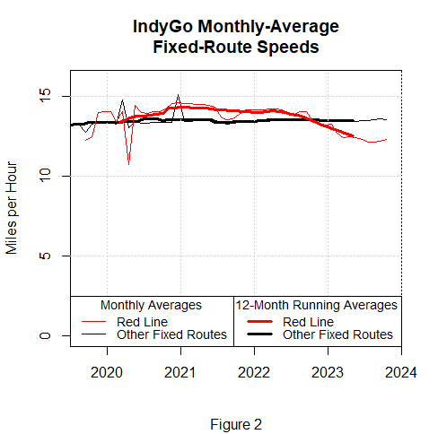
Indeed, Fig. 2 suggests that the Red Line may be losing what little speed advantage it once had over other routes’ average. Now, the spikes in Fig. 2’s plots of the FTA monthly-average data don’t inspire confidence; they raise the possibility that IndyGo’s data reporting hasn’t exactly been meticulous. But the bold curves provide running averages in the hope that doing so will tend to cancel errors out, and those curves seem to support the conclusion that IndyGo’s BRT has recently been slower than its local routes.
It is devoutly to be hoped that this recent speed reduction is only temporary. Perhaps it resulted from detours the Red Line had to take while the pavement damaged by its unusually heavy electric buses underwent repairs. But those repairs have now been completed, and any resultant speed recovery seems to have been anemic.
Consider in this connection how long a Red Line bus now takes to travel the 7.9-mile stretch (of which 4.8 miles will be shared with the Purple Line) between Broad Ripple and the Statehouse. That stretch’s riding time varies, but the value given by Google Maps on a recent Monday morning was 33 minutes. This suggests that an IndyGo-average 4.4-mile ride would take about 18.4 minutes. If we add the 4.6-minute parallel component of walking time implied by that stretch’s seventeen Red Line stops we come up with an overall travel time of 23.0 minutes.
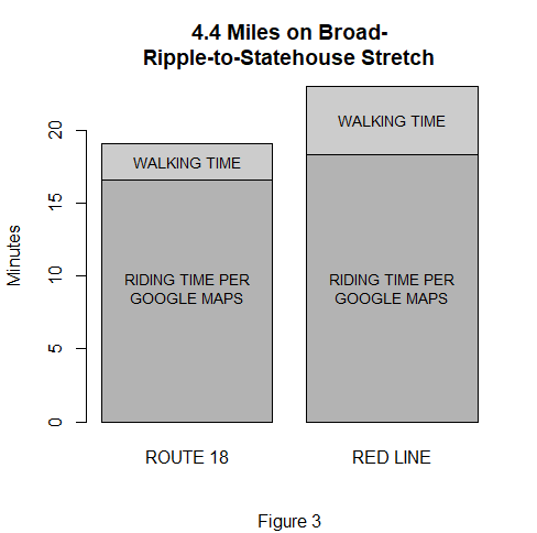
Fig. 3 shows that a same-length trip would take less time on a similar stretch of local Route 18. Even though Route 18’s stretch from Broad Ripple to the Statehouse is longer—8.2 miles—its riding time given by Google Maps for that morning was only 31 minutes. And that stretch has thirty-three bus stops, so the walking time’s parallel component would average only 2.5 minutes.
In short, IndyGo’s “bus rapid transit” hasn’t yet proved to be very rapid.
Benchmarks
Whether the Purple Line proves to be as disappointing as the Red Line has won’t be known until the Purple Line has begun operation. But in preparation for answering that question we’ll develop three benchmarks now, while the two routes the Purple Line will replace are still running.
Our first benchmark is based on IndyGo’s current Route 4, whose termini are the same as the Purple Line’s: the Transit Center downtown and Ivy Tech in Lawrence. Route 4’s 15.4 miles is slightly greater than the Purple Line’s 15.2, and it doesn’t enjoy dedicated lanes. So the Purple Line’s riding time will be disappointing if it isn’t significantly less than the 49–53 minutes that Google Maps reports for Route 4. If we include walking time, in fact, an average trip will probably take a rider longer on the Purple Line than it currently does on Route 4 unless the riding time on the Purple Line from Ivy Tech to the Transit Center is less by at least 7.8 minutes.
To see how we arrived at that 7.8 minutes, start with the fact that the length of the Purple Line equals that of (15.2 miles ÷ 4.4 miles/trip ≈) 3.5 average trips. Also take into account that the Purple Line will have only 30 stops, whereas Route 4 has 55: their respective stop spacings are 0.51 mile and 0.28 mile, so the difference between those spacings is 0.23 mile. Now assume as before that the parallel component of walking distance at each end of the trip averages one-quarter of the average distance between stops. If we double the resultant difference between those averages because there are walks at both ends of the trip, and if we assume that walking a mile takes 20 minutes, the calculation becomes 3.5 trips × ¼ × 0.23 mile/walk × 2 walks/trip × 20 minutes/mile ≈ 7.8 minutes of walking-time difference.
We hasten to add that IndyGo doesn’t run Route 4 buses nearly as frequently as it plans to run Purple Line buses, so some current Route 4 riders will undoubtedly find the Purple Line more convenient. But riders’ desire for greater frequency could be accommodated without, as the Purple Line will, depriving motorists of street lanes. And despite the Purple Line’s greater frequency the loss of bus stops may cause riders whose schedules are currently compatible with Route 4’s to find the Purple Line a step in the wrong direction.
Our second benchmark is the 12.5-mile Route 39 stretch between 38th & Post and the Transit Center. That stretch’s path differs only slightly from the 12.7-mile Purple Line stretch between those locations, and Route 39 buses come just as frequently as Purple Line buses will. But the Route 39 stretch has 57 stops instead of the Purple Line stretch’s 26. The Purple Line will therefore result in a net time loss for the average rider unless the riding time on this stretch is at least 7.3 minutes less than the 42 to 50 minutes that Google Maps reports for Route 39.
Our final benchmark is based on a stretch where Route 39’s path is exactly the same as the Purple Line’s: the 8.0 miles along 38th Street between Park Avenue and Post Road. Route 39 has 39 stops on that stretch, whereas the Purple Line will have only 14. When walking time is factored in this implies that unless Purple Line buses take at least 6.7 minutes less time to traverse the whole stretch than the 24–26 minutes taken by Route 39’s buses a Purple Line trip on that stretch will take longer than a current Route 39 trip.
Conclusion
Because of the time the Purple Line’s dedicated lanes will cost motorists, they will almost certainly reduce average Indianapolis mobility. Whether they save bus riders themselves much time is a question we can’t yet apply the above-developed benchmarks to answer. But in developing those benchmarks we have seen that any reductions in riding time will have to be significant if they’re to avoid being canceled out by walking-time increases. We’ve also seen that such reductions are unlikely to be significant unless the Purple Line performs better than the Red Line has.
"As a consequence, BRT riders have to walk farther to and from bus stops."
This to me is one of the biggest detriments to the bus riders - the less frequent stops. People coming from the feeder streets will generally have much further to walk or in the disabled cases - navigate their wheel chairs, etc. in all types of weather and conditions (not to mention increased opportunity for crime, dog attacks, etc. - real hazards of bus riding). These buses will be less convenient - particularly by making everyone have to cross the street no matter their destination - wherever there are center-lane stations. It is hard enough feeling safe along the street edges. Who wants to stand in the middle of the street containing 50-mile per hour traffic. The BRT is a planner's wet dream, but it will be a nightmare for the average citizen. And they will have the same problem (maybe even worse, with non-paying riders - as people will board in the back (no one checks). Also when boarding, bikes have to be hung internally. When I tried to do it, I almost fell over as I was lifting my 30+ pound bike because the bus started moving as soon as I was in the door - to try to maintain their illusion of "rapid" bus transportation. And the bus racks are near the center turntable making it even more hazardous to bike hang (and when the buses are actually crowded, I wouldn't even want to imagine the difficulty of dealing with these issues.